Some Thoughts ...
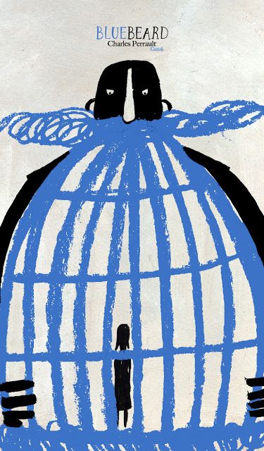
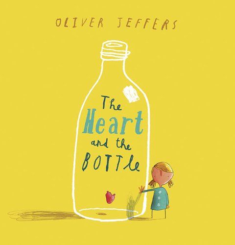
When I lived in Florence, Italy for 7 months studying printmaking and painting, I lived with a family that I became very close to, and still after over 10 years, try to keep in touch with. I used to go to the book markets and collect children's books to learn the language better, since my host mother at the time did not speak english 100%. This tradition has been carried through my travels over time to other countries... I have one from our Amsterdam trip last year, one from Croatia, lots from Italy when I studied, one from Paris and one from Spain. It's not mandatory when I travel but if I love a book in a foreign country that's simple language and has beautiful illustrations I like to capture the essence of the place, and my trip that way. I hope my kids use them at some point in their life, but for now they are used as illustration inspiration and a token from each city experience.
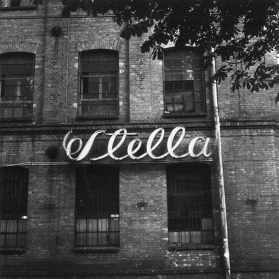
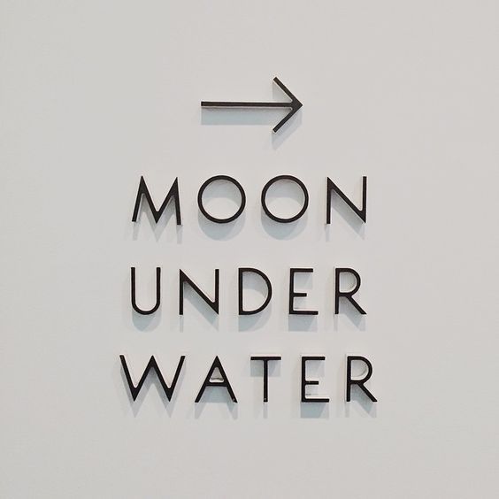
Louise Fili, a huge inspiration to me, began her own "library" of sorts by going to Italy and taking photos of signage she loved. From there she had an archive of inspiration to go back to for her own work. I have to say, not knowing I had this in common with Louise, in addition to some childrens books across the seas, I love taking photos of signage to bring into my work somehow. I love the way they are designed, what material they are made in, how they are installed, and lit up. I hope to someday be better at hand-lettering to be able to really incorporate it into my work more and to most importantly, have an amazingly designed, made, and installed sign of my own on the streets of the world wherever we land.
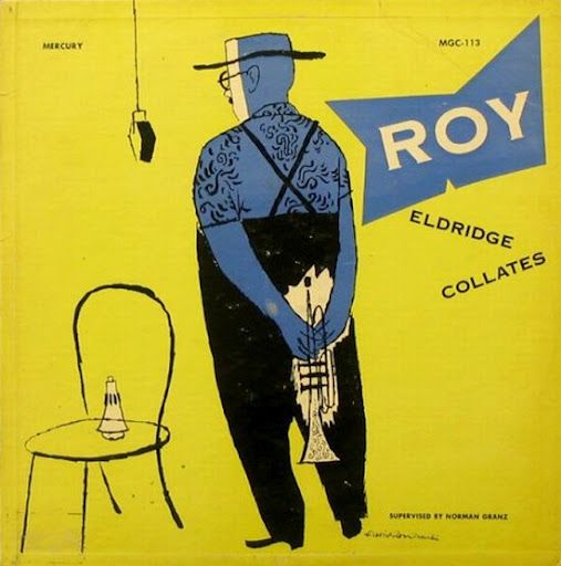
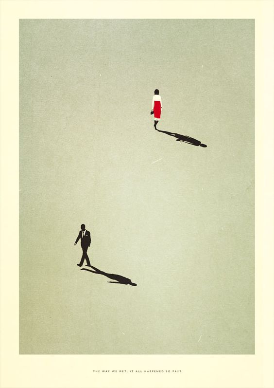
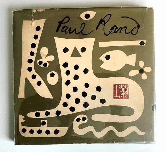
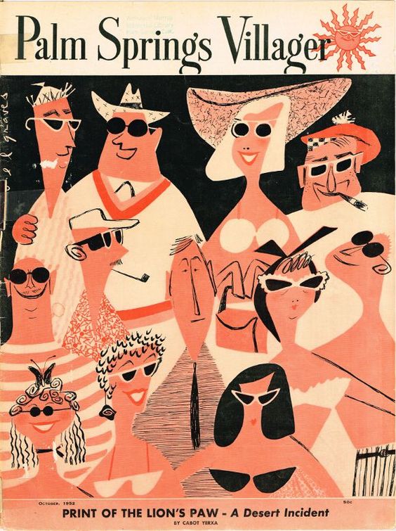
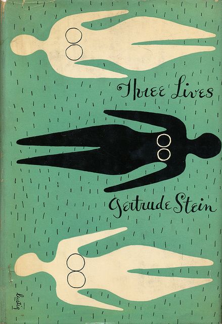
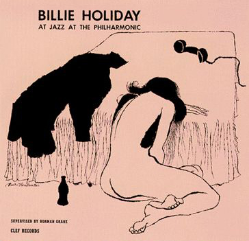
Another great source of inspiration to me has been the design of record covers and movie posters in the 50s-60s. Something about the simplicity of the designs, the use of color, transparency, illustration, photography, really call to me and the work I pay homage to whenever I design, or art direct. For instance the image I used as the thumbnail of this post is so gorgeous but is so deeply rooted in such a sad and powerful story about the way jazz music, during the 18th century, was an outlet for the horrible daily events going on in the African American community... Here's a really amazing article about what was going on, and the background to this powerful artwork.
I used to think I was not a good designer back when I was younger, because I never gravitated to computer illustrated, highly graphic, "in your face" type of design. What I found as I designed and illustrated more and more was that it's okay to not be bold and loud to get attention, but to have a style that is approachable... that people generally enjoy. The artwork for the Billy Holiday album talked about above, is a perfect representation of how simple but emotional artwork can tell a very powerful story, and engage your audience. It can even provide peace through beauty, during a hard time.
I think that is why I chose to collect children's books in some of my travels because it simplified my over-the-moon feelings of traveling in Europe, especially, and allowed me to take something that was approachable and joyful along with me throughout my life.
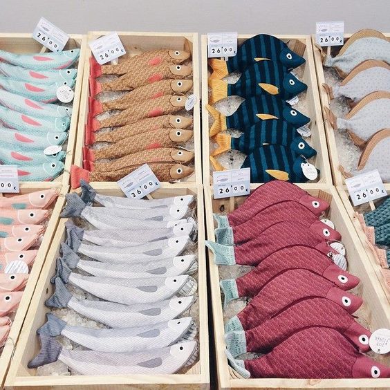
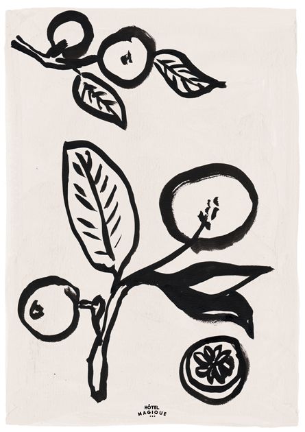
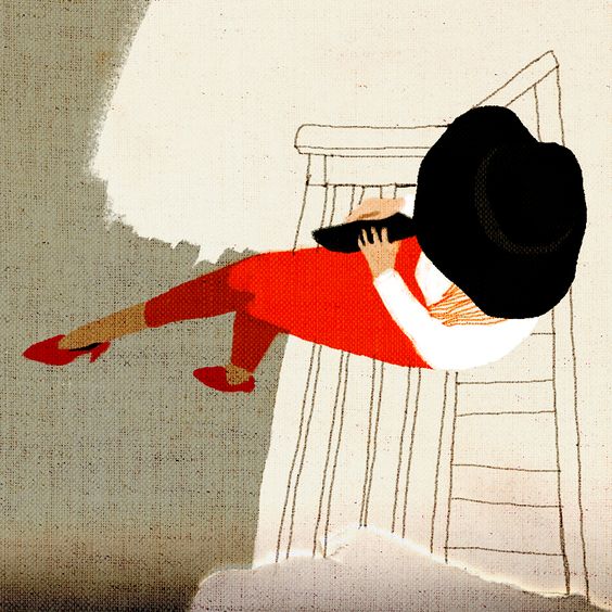
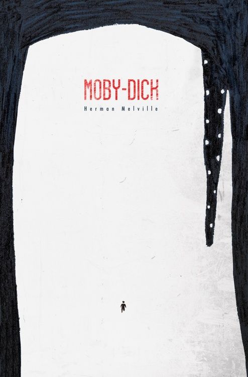
Here are some inspirations I've found along the way... also follow me on Pinterest to see a daily dose of inspirations flowing through my head and the studio on a daily basis!